Replied in thread

@mms rather not cool, but somehow efficient: #awk, #gnuplot, #orgaggregate

@mms rather not cool, but somehow efficient: #awk, #gnuplot, #orgaggregate
Are there any #gnuplot experts around?
I've a few 10s of files I want to plot, each with a specific RGB colour line. I can use for for loop to iterate over the file names to plot OK, but I can't seem to use it to iterate over the colours too. Any ideas?
plot for [dataset in "F1 F2 FZ"] dataset.".csv" for [c in "#986aba #485f8b #5e96d1"] with lines lw 2 lc rgb c
In my view that should pick the file name from the list of names and plot it with the first colour from the list of colours (rgb val)
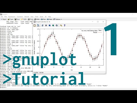
really nice short tutorials of how to plot with #gnuplot https://www.youtube.com/watch?v=9QUtcfyBFhE
The updated "What is Driving Criminalization of Women and LGBTQ People?" publication from Interrupting Criminalization has been published!
I contributed data collection and analysis work, with much guidance and patience from Andrea and Rachael. Data from multiple sources along different points in the incarceration pipeline, make very clear the intense level of racial bias. Seeing this, along with the recent trend in increased incarceration and criminalization was sobering.
When you hear about the administration forbidding certain words and classifications in data sets and reports, know that it is an attempt to hide this.
The data analysis work was done with #emacs #gnuplot #clojure #duckdb and #orgmode in support of #prisonabolition #decriminalization and #socialjustice
https://www.interruptingcriminalization.com/resources-all/whats-driving-2025-update
The interactive calculation sheet for #engineering, based on #emacs, #orgmode, #texlatex and #sympy is available in English [1], although the blog article is in German [2]. The template is also in English [3].
#Orgmode is so impressive, you could use #maxima, #octave, #gnuplot, #graphviz and almost 40 other languages with all their libraries right out of the box [4].
Have fun!
[1] https://vennemann-online.de/flossblog/downloads/eng.pdf
[2] https://vennemann-online.de/flossblog/post20250208_pencilandpaper.html
[3] https://vennemann-online.de/flossblog/downloads/org_eng.zip
[4] https://orgmode.org/worg/org-contrib/babel/languages/index.html

FTR, this paper was written entirely in #orgmode in #Emacs: a simple export to LaTeX and then upload resulting files (including images created via src blocks, e.g. with #gnuplot, #graphviz, and #PlantUML) to #arXiv. Thank you to all the code developers for all those tools for creating such a powerful, useful, and efficient working environment for coding, analysis, and writing prose.
And all of it #FOSS!
#gnuplot is great. I've been feeding the results of #sqlite queries into it via org-babel, and it works almost perfectly; the only exception being that I can't use column names in the gnuplot dataset.
Maybe I'll write a blog post about that... In some moderately distant future.
It feels much less accessible compared to #matplotlib, but not more so than #emacs, I guess. And it's great not to carry any dependencies except the gnuplot library, particularly for the Org Mode use case.
The charts sometimes look like a hello from the 90s, but to me it's a plus that they don't give the "matplotlib on defaults" vibe which is omnipresent in modern science :D
![#+NAME: mastodon-posts-monthly
#+begin_src sqlite
SELECT strftime('%Y-%m', timestamp, 'unixepoch') month, count(*) FROM mastodon_post
WHERE is_reply = 0
GROUP BY strftime('%Y-%m', timestamp, 'unixepoch')
#+end_src
#+HEADER: :post out_wrap(caption="Public Mastodon posts per month", data=*this*) :results raw
#+begin_src gnuplot :noweb yes :var data=mastodon-posts-monthly :file ./img/mastodon-posts-monthly.png
reset
set title "Mastodon Posts per Month"
set xlabel "Month"
set ylabel "Post count"
set xdata time
set timefmt "%Y-%m"
set format x "%Y %b"
set xtics rotate by 45 right
set boxwidth 0.8 relative
set grid lc rgbcolor "#A0A0A0" lt 1 lw 0.5
set grid back
plot data u 1:2 w boxes notitle fs solid lc rgb "web-blue"
#+end_src
#+RESULTS:
#+CAPTION:Public Mastodon posts per month
[An image with the bar chart]](https://media.bsd.cafe/bsdmmedia01/media_attachments/files/113/760/955/407/727/906/original/1855ad10ee83a021.png "#+NAME: mastodon-posts-monthly
#+begin_src sqlite
SELECT strftime('%Y-%m', timestamp, 'unixepoch') month, count(*) FROM mastodon_post
WHERE is_reply = 0
GROUP BY strftime('%Y-%m', timestamp, 'unixepoch')
#+end_src
#+HEADER: :post out_wrap(caption=\"Public Mastodon posts per month\", data=*this*) :results raw
#+begin_src gnuplot :noweb yes :var data=mastodon-posts-monthly :file ./img/mastodon-posts-monthly.png
reset
set title \"Mastodon Posts per Month\"
set xlabel \"Month\"
set ylabel \"Post count\"
set xdata time
set timefmt \"%Y-%m\"
set format x \"%Y %b\"
set xtics rotate by 45 right
set boxwidth 0.8 relative
set grid lc rgbcolor \"#A0A0A0\" lt 1 lw 0.5
set grid back
plot data u 1:2 w boxes notitle fs solid lc rgb \"web-blue\"
#+end_src
#+RESULTS:
#+CAPTION:Public Mastodon posts per month
[An image with the bar chart]")
Whenever I make plots with Matplotlib, I end up feeling confused and uncertain about why it works. When I make plots with #Gnuplot I end up feeling satisfied that it works, and I understand why. Both are quirky and confusing every time I use them, but I always end up with a better feeling from Gnuplot. I really need to learn more about it.
It has been a long time since I last used #gnuplot, I think I was still in university back then. It is still exactly as awkward as I remember it…
Ihr erinnert euch an mein Performance Problem, dass #gnuplot nicht so schnell läuft auf System B wie auf System A?
Nun…mit der Version von gnuplot hatte das alles gar nichts zu tun. 
Die Single Core Performance der CPU von System A ist einfach 4x höher als von System B. 
Hab das mit #sysbench von #Debian getestet. Primzahlentest. Und damit war die Sache klar. 
Hi #PhysikEDU und #MatheEDU, kann mir jemand sagen, warum bei einer Regression verschiedene Werte rauskommen, wenn man z.B. statt in V und mm in kV und cm eintippt. #Geogebra, #gnuplot und ein TI CAS liefern jeweils das (s_y = a · U_B^b):
- V und mm → a=10003.708679618mm/v; b=-0.97498704493556≈1
- kV und cm → a=1.1890494085993cm/kV; b=-0.97498704493556≈1
- V und m → a=10.003708679618m/V; b=-0.97498704493556≈1
Warum kommt mit Potenzreg. bei kV/cm ein anderen Wert raus für a.

Whoever designed #gnuplot language shall be shot and then jailed for a decade. It hurts almost that bad as reading its <air quotes>documentation</air quotes>.
this is a really great commandline/shell book if you need to do quick #data - suitable in particular for any SRE, admin, #observability or platform engineer who are already living cli tools anyways and are asked those "how many..." and "when did..." : https://jeroenjanssens.com/dsatcl/ also, consider learning a little #gnuplot and #R - both VERY helpful.
Using #gnuplot as the rendering engine for my nbody simulation because I can't remember how to do perspective correction when rasterising 3D points in an image.
I think I'm gonna hack some nice #perl next year, haven't done that in a while. I also have a bunch of #R things I need to try, #D3 and some other libs and #gnuplot are waiting too and the rest will be lots of #SQL, a bunch of #go anyways and some #rust to be continued until it doesn't hurt anymore. ;) #programming
Is #Perl @Perl a write only language?
I say NO and show some of the goodies in the new perl versions, i.e. function signatures).
https://statmd.wordpress.com/2023/12/07/is-perl-a-write-only-language/
(cross post at #github pages)
https://chrisarg.github.io/Killing-It-with-PERL/2023/12/06/Is-Perl-a-write-only-language.html
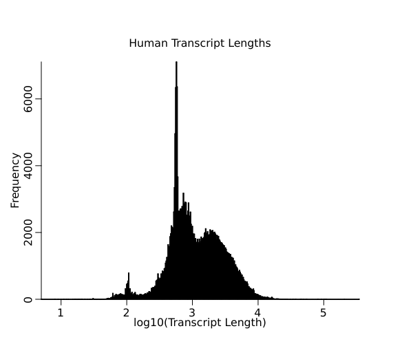
And in case you were wondering, this is the human #RNA length distribution graphed with #perl and #gnuplot